As McElroy continues to improve the ways Vault™ users can leverage the data stored there, we recently introduced Vault™ Insights, designed to provide a top-down look at operators, machines, jobsites, and more.
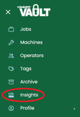
The Vault Insights page allows an account holder to take action from the data collected. This interactive page includes metrics that illustrate how operators and machines are performing. Information is displayed in a variety of ways, with users able to further filter their results or display them in a different way, such as a pie or line chart.
Currently, Vault insights are available for the following: Operator Performance, Machine Performance, Job Analysis, and Pipe Analysis.
(Please note that Weld Analysis and Location Analysis are not yet available and will go live in a future update.)
Read on for a breakdown of the features available in each tab.
Operator Performance
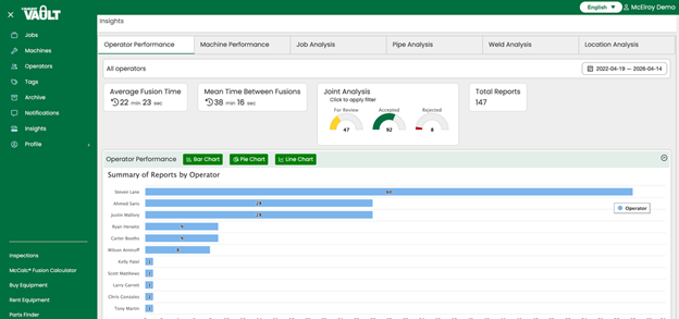
The Operator Performance tab allows you to quickly view joint exception analysis for all your operators. Clicking on the one specific operator in the section with the blue bars shows you information for just that operator.
On this tab, you can view Average Fusion Time, by operator. This lets you know how many joints are being fused and can help you determine if there are any opportunities for jobsite optimization. You can also find Mean Time Between Fusions, a powerful metric that can help you identify gaps in setting up for the next joint or any areas where individuals may need additional training.
Machine Performance
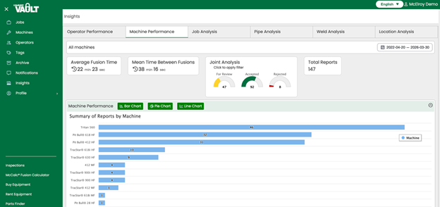
Similar to Operator Performance Metrics, the Machine Performance tab allows users to see Average Fusion Time and Mean Time Between Fusions, but users can dig deeper and click on a particular machine to view its relevant metrics.
Job Analysis
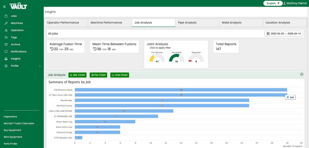
The Job Analysis tab tracks site metrics like average fusion time, mean time between fusions, and joint analysis.
Pipe Analysis
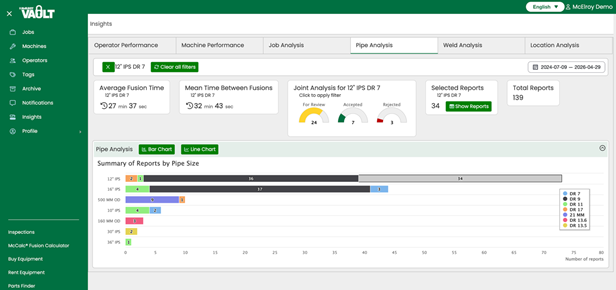
The Pipe Analysis tab displays all pipe sizes and shows that in a bar chart. Clicking on one particular pipe sizes shows the metrics and allows you to view the corresponding reports.
In the coming months, we will continue to outline different Vault features that can be leveraged to help you and your team make the most out of the data available. For questions or more information about Vault Insights, contact your McElroy sales representative.